Introduction
In this short tip, I provide a few easy steps to setup an editable grid using Bootstrap and
ShieldUI-Lite.
ShieldUI-Lite is an open source jQuery library, which includes, among other components a
jQuery grid ,
which supports editing out-of-the-box, as well as sorting, grouping and different column editors.
For the example in question, I use a local data source, in order to keep things simple.
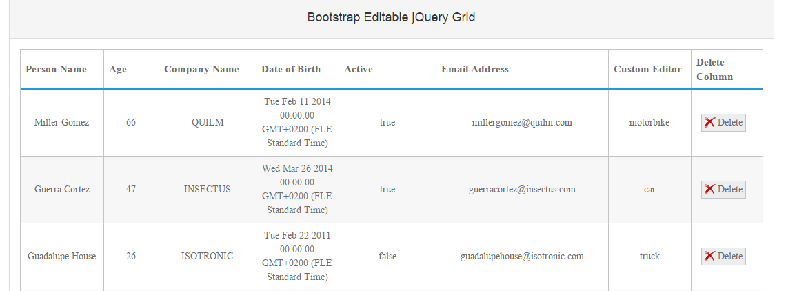
The final sample looks like this:
Using the Code
The first step in setting up the layout is to use a standard Bootstrap container. In our case, this is a div, nesting a Bootstrap panel.
Since any standard web grid component usually hosts a lot of data, our layout spans over the entire width of the screen.
The code for this step is straightforward and looks like this:
<div class="col-md-12">
         <div class="panel panel-default">
        <div class="panel-heading">
         <h4 class="text-center">Bootstrap Editable jQuery Grid
         <span class="fa fa-edit pull-right bigicon"></span></h4>
        </div>
     <div class="panel-body text-center">
         <div id="grid"></div>
     </div>
    </div>
 </div>
This is all the HTML needed to setup the sample.
The next step is adding references to all the resources used in the sample, such as stylesheets, JS files and data.
The data used for the example is a standard JSON collection, which is loaded separately in order to be passed to the grid component.
Using a local data source simplifies the setup. Additionally, needed are the stylesheet for the grid and the .js for initializing it.
The inclusion of these resources is demonstrated below:
<link rel="stylesheet" type="text/css" href="domain/ShieldUI-Lite/dist/css/light/all.min.css" />
<script type="text/javascript" src="domain/ShieldUI-Lite/dist/js/shieldui-lite-all.min.js"></script>
<script type="text/javascript" src="domain/Content/data/shortGridData.js"></script>
Setting up the Grid
The next step in the process is setting up the ShieldUI-Lite grid component.
Once we have included the necessary resources, we can initialize it with some JavaScript, in the document.ready event.
There are two logical parts in describing the component. The first is handling the datasource for the data that will be visualized in the grid,
and the other one is setting up the columns, which will be actually rendered, as well as any additional settings, such as sorting, hover effects, etc.
The ShieldUI-Lite Grid has a built-in dataSource property, which makes it easy to bind the widget to any data - local or remote. To link the dataSource to the json data, we use the data property and describe the fields, which will be fetched.
The code to achieve this is listed below:
dataSource: {
                data: gridData,
                schema: {
                    fields: {
                        id: { path: "id", type: Number },
                        age: { path: "age", type: Number },
                        name: { path: "name", type: String },
                        company: { path: "company", type: String },
                        month: { path: "month", type: Date },
                        isActive: { path: "isActive", type: Boolean },
                        email: { path: "email", type: String },
                        transport: { path: "transport", type: String }
                    }
                }
            }
Enabling Editing
The next step in the process of setting up the application is choosing which properties will be available in the grid, as well as describing the columns,
which will be rendered. Each column can have additional properties, such as header text and width.
The width property setting is not obligatory, but provides addditional flexibility for distributing the overall layout.
The code for all the properties in the control is listed below:
sorting: {
                multiple: true
            },
            rowHover: false,
            columns: [
                { field: "name", title: "Person Name", width: "120px" },
                { field: "age", title: "Age", width:"80px" },
                { field: "company", title: "Company Name" },
                { field: "month", title: "Date of Birth",
                format: "{0:MM/dd/yyyy}", width:"120px" },
                { field: "isActive", title: "Active" },
                { field: "email", title: "Email Address", width: "250px" },
                { field: "transport", title: "Custom Editor", width: "120px", editor: myCustomEditor },
                {
                    width: "104px",
                    title: "Delete Column",
                    buttons: [
                        { cls: "deleteButton", commandName: "delete",
                          caption: "<img src='source/delete.png' />
                          <span>Delete</span>" }
                    ]
                }
            ],
            editing: {
                enabled: true,
                event: "click",
                type: "cell",
                confirmation: {
                    "delete": {
                        enabled: true,
                        template: function (item) {
                            return "Delete row with ID = " + item.id
                        }
                    }
                }
            },
Setting Up a Custom Editor
The widget supports out of the box a number of handy editors. Once the control is put into edit mode, by clicking on any of the cells,
the editor for the cell will be dependent on the type of values in this cell.
For example, a numeric value will have a numeric input with increment and decrement buttons.
A date column will have a Calendar input for easily picking a date.
There is also the option of supplying a custom editor for a column.
For example, instead of having a standard textbox, we can have a dropdown with all the values for that column.
This can be achieved by attaching to the
getCustomEditorValue event and passing a custom editor for each cell.
This is demonstrated in the following code snippet:
events:
            {
                getCustomEditorValue: function (e) {
                    e.value = $("#dropdown").swidget().value();
                    $("#dropdown").swidget().destroy();
                }
            }
        });
    });
    function myCustomEditor(cell, item) {
        $('<div id="dropdown"/>')
            .appendTo(cell)
            .shieldDropDown({
                dataSource: {
                    data: ["motorbike", "car", "truck"]
                },
                value: !item["transport"] ? null : item["transport"].toString()
            }).swidget().focus();
    }
If you would like to review more information on the options in the grid widget, you can refer to this
section
This completes our setup and the control is ready to use. You can download or review the complete code
here.