10 Best Practices for Responsive Design
Responsive design has become the most preferred method for creating websites, because it provides optimal visualization that is suitable for different devices (mobile phones, tablets, desktops, etc.) and screen resolutions. The purpose of this adaptive page adjustment is to minimize the need for resizing and scrolling.
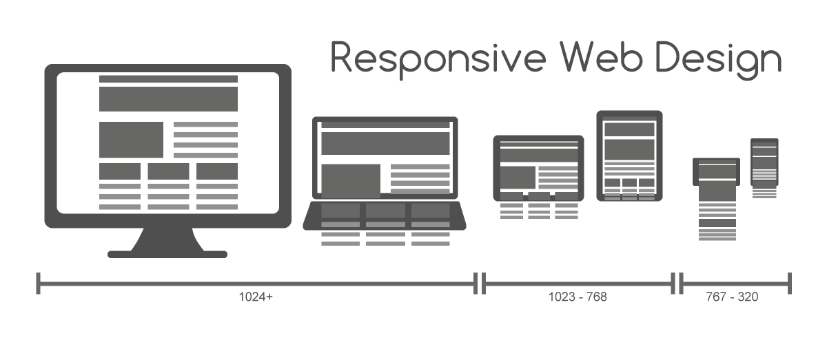
A responsive website adapts its content to the environment in which it is visualized, through the use of flexible grids that are based on proportions (based grids), and flexible images.
In this article, we will discuss the 10 most-important rules of best practice for responsive design.
Think About Context
The fit-to-size process may make sense in terms of scalability, but it ignores the actual content that is presented in this layout (content must be considered).
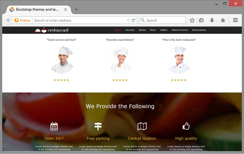
Think of a website for a restaurant. You would certainly want the site to look good on mobile screens. There is, however, a lot of context and variables - you need to consider what is most important to different visitors who use this device.
You may at first think that because they are on a mobile device, these customers are looking for opinions or directions to the restaurant, but what if they are already in it? In this case, even though they are on a mobile device, they obviously don’t need guidance. Instead, they may be looking for something like nutritional information for the restaurant’s menu.
Practice Thoughtful Reduction
There’s a so called "mobile first" approach, in which the designer needs to focus only on content, to show what’s most important for consumers and to remove anything that is superfluous.
When going through this process, some functions for larger screens need to be removed for mobile devices. Deleting items from the page requires a bit of aggressive approach, but a successful designer must learn how to be ruthless in this regard. Retain only what's important.
Plan Big and Small Designs
The secret behind the success of responsive design is that it allows for good visualization on devices of different sizes. Sometimes this creates a problem for designers, had they not thought it out good in advance, because what usually they think the most about is visualizing the design on a small screen, while often times it is used on very large screens.
For the past few years, mobile traffic to sites makes up the largest share of all traffic. Although this statistical data suggests that it’s important to optimize the design for mobile devices, this should not come at the expense of the larger desktop displays. There are still many people who visit sites through them.
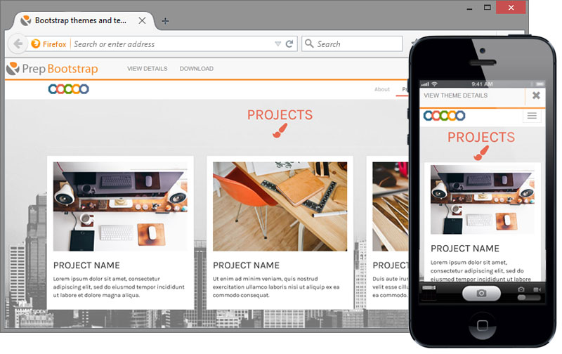 Roah Single Page Bootstrap theme shown on a big and small screens
Think about larger screen sizes. Remember that new devices are introduced daily on the market (there are now more than 24,000 different Android devices), so popular sizes today may not be such in the near future and sizes that are not even in our focus today can become critically important tomorrow.
Scalable Navigation
Navigation is one of the most difficult aspects of responsive website design and particularly of the efficient site mapping, especially when the site has very long or deep menus. What works well for larger screens does not always necessarily work for other devices.
You should be as consistent with the design of your navigation as you can - this includes labels used for buttons and links and the visual characteristics of these buttons (choice of font, color, etc.). As designers, we want these images to look their best. It is very important to find a balance between rich visuals and overall presentation of the page. When designing a responsive website, we should consider which images are necessary and which are those that should be removed.
Homepage carousels and the like need many big images and underlying scripts in order to create the otherwise beautiful animation effects, so they should be reconsidered. A static image makes the loaded page size three quarters smaller, while also getting rid of the JavaScript animation code under the hood. Once we have removed all the unnecessary images, the others must be optimized.
Use Icons Where Appropriate
Icons can do much for the improvement of a website’s design when they are used accurately. Nicely designed icons provide the same information as many words of text. This is most important on a small screen’s limited real estate.
Icons can be vector files, which are a great choice as they can be resized as needed, without adding bits to the file size of the images themselves.
SVG files can be animated with CSS, adding some interesting effects to our design without overloading it with many additional backstage scripts that will have a negative impact on the efficiency of the site.
Think About Input Methods
Various devices mean different input methods. Desktop users enter data using mouse and keyboard, which is very different from the method of introduction of information used by a consumer on a mobile device, who inputs with his or her fingers.
Apple’s iOS Human Guidelines recommend size for square buttons on smartphone screens to be about 44 points.
Every design should be tested by a minimum of five users on the different devices that will be used to view the website.
Web developers and designers today are making extensive use of third-party frameworks that provide out-of-the-box responsive UI components.

Do not Be Afraid of White Spaces
Another important thing for a great website design is the efficient and effective use of white space. For non-designers white space looks like a place where no design has been applied. For experts, however, any part of the space that they have used is deliberately designed.
Too often, companies think of their website as if they were newspapers. They seek to fill all available pixels with one type of content, but websites are not newspapers. For website visitors, the white space between elements on a page allows for enjoyable reading. It also gives them time to be able to focus on individual pieces of a page without being overwhelmed by the rest at the same time.
Parallax scrolling is one of the most interesting means of space utilization. It is an effect which makes the foreground images on the site scroll at a different rate than the background, giving the impression of depth and real motion. It may be used extremely effectively as a storytelling element. The various page elements (text, images, etc.) may show up on screen at pre-set times as the page is scrolled. Good timing and effective spacing are essential for the maximum impact of those features on the user experience.
There are, however, intuitive plugins for parallax scrolling that make adding these effects and correct spacing between elements a whole lot easier, without the need of fiddling with any code at all.
Pay Attention to Font Size
Typography is a very important aspect of web design. This is one of the reasons why people have created so many different styles and fonts - to convey ideas and information in a way that will be enjoyable and interesting.
When choosing a font, we make sure that your font works well and keep the overall feel we want, regardless of whether the site is shown on a larger or smaller screen. Some fonts with thin letterforms can work well on a large or even medium size displays but these letterforms lack clarity when they are resized down too low. This will adversely affect the readability of the site, which is never acceptable.
If you must use a special font with thin letters, make sure that it can be read even in the smallest size, or consider substituting a different font for these smallest sizes. In a wider column of text the line-height (vertical height of each line of text) is needed to help readers’ eyes find next line of text. A 16pt type for body is both default for most browsers and a good place to start for all screen sizes. But this is not the end of all requirements.
Titles should be clearly positioned and be at least 1.6 times as large as the text they head. Adequate contrast should be designed for every element of the site, including the text against the background color and the color of the links against both and the rest of the site’s content.
Keep the Design Simple, Fresh, and Unique
Your website is a reflection of your brand. It is the very first impression visitors will form about it when they visit your site for the first time. The homepage is usually the most important page of the entire site. Moreover, small businesses and startups have less than a total of ten pages and the home page is even more of an important anchor for the overall site experience. It should answer some important questions - including who you are and what you do.
Think about the impression you want to do and the message you want to communicate with your customers, current or potential.
You should also consider the fact that visitors can visit the site from laptops and mobile phones, so try to avoid creating pages for larger monitor sizes or ones that use more complex functions like flash animation or complex navigation.
Test your Design on Actual Devices
Planning how your project will be displayed in different sizes is an important part of the responsive design, but you can’t stop up to the planning.
The design should be tested on the actual devices in order to find out if it really works the way you planned or improvements are required.
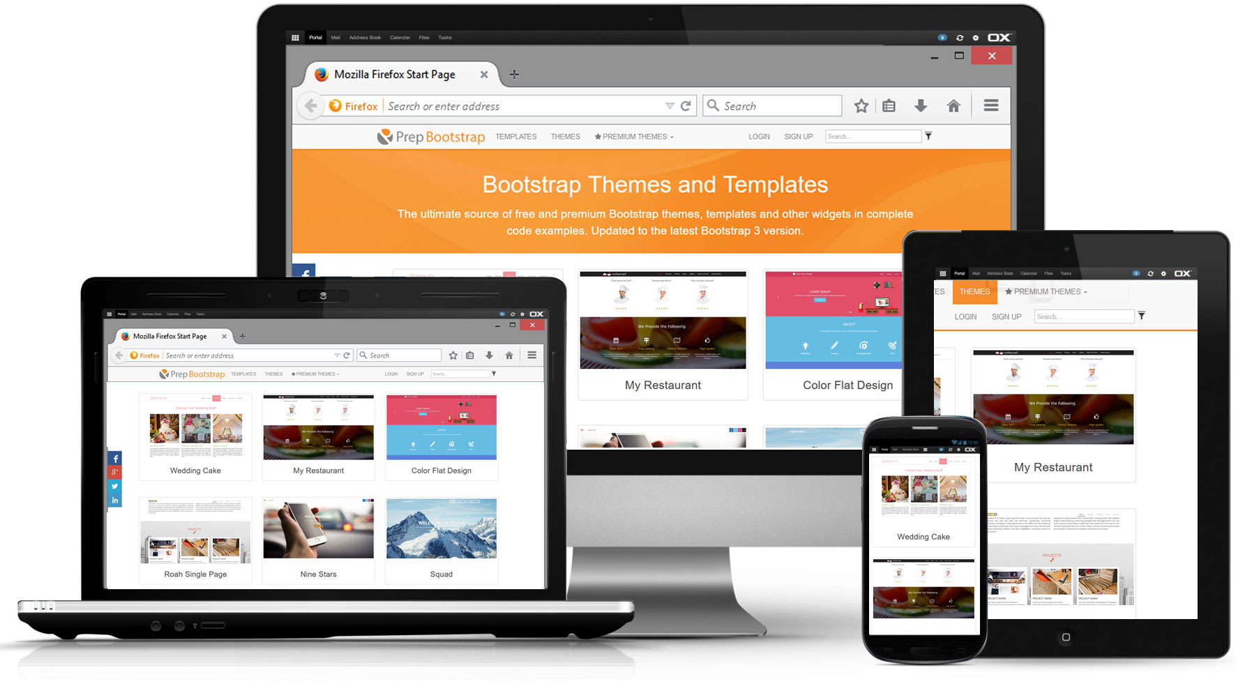 Bootstrap Themes and Templates
Some Additional Hints
Building compelling web sites and mobile apps is a complex process, which involves a number of dynamic technologies. While software components do alleviate this challenge to a certain extent, no single component is enough by itself. When one is looking for the perfect solution, it has to come as part of a comprehensive package – solid product, created by experts in the field, who are available for direct 24/7 support of their product.
Take productivity and presentation to a new level by harnessing the power of the ShieldUI JavaScript UI Framework and its server-side platform wrappers for ASP.NET, ASP.NET MVC and JAVA Apache Wicket.

